The Process
I did market research to see what desirable features current hiking apps in the market have, which elements they have that could or should be left out, and figure out what was lacking in overall usability for similar apps. A complete breakdown is available on page 4 of the PDF presentation.
For this process I leaned heavily on created personas to decide what features my app should have and how to design the interface based on how the personas would interact with it in the context of each of their lives. The personas I created were not based off of any data that I had, only my understanding of what kind of people my app is likely to be most attractive to.
TrailFinder
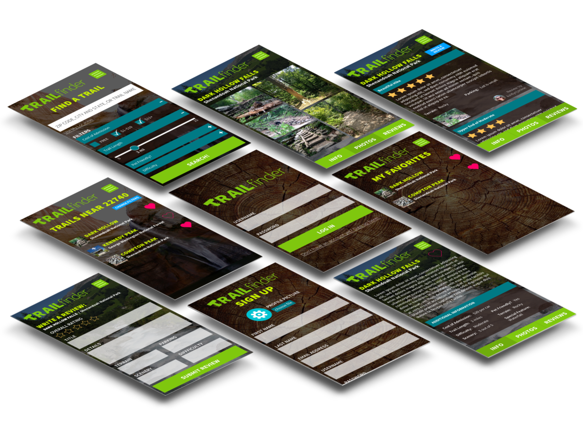
Using this app, users can find trails near them using GPS location or in a certain area by searching city and state. Each trail has length, grade, difficulty level, photos, and description. It also designates pet friendly trails and, when possible, it includes the cost of park admission. Because it can be difficult to gauge if a trail is right for you based on a description alone, the app allows users to rate each trail as well. There is a star rating system for multiple categories in addition to an overall rating and explanation, similar to ModCloth’s rating system.