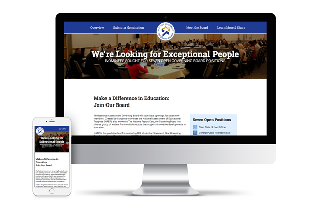
Project Concept
Create a site that will increase the nomination submissions and provide information that interfaces with an extensive social media campaign.
- Fireworks
- HTML 5
- CSS 3
- Javascript
- jQuery
Research
Extensive analytics analysis was performed to see what users needed help with in previous years. The client relies heavily on analytics information to judge the success of this particular campaign each year.
Target Audience
Nominees and Nominators of open NAGB board positions
Design Solution
I created a minimal interface with large amounts of white space to give the site a modern feel. I wanted to highlight the information itself. This is a very informational type of site; it’s imperative that users are able to access and process the large amount of information, so I broke it into smaller chunks. Nomination submissions actually went up by a significant amount after implementing this design for the duration of the campaign. Rather than doing a redesign every year as they had been, they decided to stick with the same one for the next year’s campaign since it was so successful.